You're about to create your best presentation ever

Wustl Presentation Template Slides

Create your presentation by reusing one of our great community templates.

WUSTL project

Transcript: Initial Research Universities- This software can be shifted for research purposes. Public/Private middle and/or highschools Tutor companies Production Collaborate with manufacturing companies Come up with a design and perfect it Form of information delivery to customers ie. stores, online, television Problem Solving Brief training on how to use new software Have an IT department for any problems in the hardware Work out any kinks in software Works Cited Quizzes at the end of lecture/ software assigned homework added to software. Product Changes Customer Relationships Service - Students don’t get left behind - Get students extra help if confused - Builds knowledge in areas of confusion Who - Students in middle school and high school What does the product solve? - Kids falling behind in school - Kids failing classes - Confusion in certain subject Student ran tutor systems added to the software Heart rate monitor Value Propositions Further Research Key Partners Facial biometric systems - $600 + modification cost Hand geometry systems- $800 + modification cost Heart rate monitor- $200 Software cost- freeware + modification costs. Software engineers Distribution cost Cost and Resources Fourth grade teacher - "Great product! A possible improvement can be to add quizzes and software assigned work in areas that need improvement" Origin of biometrics Typical biometric system Reliability Technology in phones Sentecs Get Customers Strike Interest and Gain Awareness - Advertisement via television, internet, radio Keep Customers Make sure that the product is successful Get customer feedback using things like surveys and then actually use customer ideas Keep the technology new and involved Grow Customers Widen the customer "fan" base Spread the word through already acquired customers Encourage them to tell friends and other educational facilities and so therefore spreading the information and the use of the product Key Activities Shen, Weicheng, and Tieniu Tan. "Back Matter." Proceedings of the National Academy of Sciences of the United States of America 107.42 (2010): 11065-1066. JSTOR. Web. 10 July 2014. <http://www.jstor.org/stable/10.2307/25748468?ref=search-gateway:fc442df111855bac2cfcfca129c81339>. Maguire, Mark. "The Birth of Biometric Security." Anthropology Today 25.2 (2009): 9-14. JSTOR. Web. 10 July 2014. <http://www.jstor.org/stable/10.2307/20528212?ref=search-gateway:797bf2bfa1c33f412870f2b32678515e>. Dass, Sarat C., and Anil K. Jain. "Fingerprint-Based Recognition."Technometrics 49.3, Special Issue on Statistics in Information Technology (2007): 262-76. JSTOR. Web. 10 July 2014. <http://www.jstor.org/stable/10.2307/25471347?ref=search-gateway:56d3ca55414f863665b9c8bb9016e58d>. Stigler, Stephen M. "The Problematic Unity of Biometrics." Biometrics 56.3 (2000): 653-58. JSTOR. Web. 10 July 2014. <http://www.jstor.org/stable/10.2307/2676905?ref=search-gateway:c2ca84281f1aba87da114e7c1fd999a3>. Apps available for cell phone/ tablet usage Customer Segments Business institute program attendee- " I would invest greatly in your product; however, a student ran tutor system added would be great!" Biometrics definition Biometric identifiers (physiological and behavioral) Existing technology Seven factors to assess biometric authentication "Confused Face Expression." FaceTurn -. N.p., n.d. Web. 09 July 2014. "Advantages and Disadvantages of Technologies." Biometrics /. N.p., n.d. Web. 09 July 2014. "Schlage Recognition System HandKey II." Biometric Reader Hand by. N.p., n.d. Web. 09 July 2014. "The True Costs of Free and Low-Cost Software." Idealware. N.p., n.d. Web. 09 July 2014. "Biometrics." Dictionary.com. Dictionary.com, n.d. Web. 10 July 2014.

Presentation slides

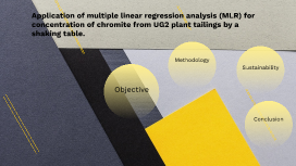
Transcript: Application of multiple linear regression analysis (MLR) for concentration of chromite from UG2 plant tailings by a shaking table. Chromite Introduction Chromite is a very important mineral which is the only viable source of chromium (Maruli & Nheta, 2020). Chromite as spinels- chromium (Chromium), iron (Fe), Magnesium (Mg) and aluminium (Al) (Anacleto, N. M., et al., 2018). Spinels depends upon the deposits type. Ultramafic igneous rocks Tailings Mining generates large quantities of tailings composed of ore particles and waste. Tailings have untapped potential as a resource for mineral recovery. Processing UG2 plant tailings, rich in chromite, can provide economic and environmental advantages. Concentrating chromite from tailings reduces the demand for new mining, lessening environmental impact. Background and significance Objective Objective The primary objective for this project is to develop a predictive model to optimize the concentration of chromite from the UG2 plant tailings by a shaking table. The MLR is a technique that is used to analyze the relationship between independant variables and dependant variable. Steps Involved in Sample Preparation Methodology Sectioning / Cutting a Specimen Mounting Grinding Polishing Etching Sustainable development goals Sustainability This project aligns with principles of sustainable development by promoting efficient use of mineral resources. #SDG 3 - Good Health and Well-being #SDG8 - Decent Work and Economic Growth #SDG 9 - Industry, Innovation, and Infrastructure #SDG 11 - Sustainable Cities and Communities #SDG 12 - Responsible Consumption and Production Conclusion Conclusion

presentation slides

Transcript: My target audience is of the black youth culture, Christians/ non- Christians aged 14-24 interested in rap/hip-hop. I chose this group as rap/hip-hop has always been popular among youth but making it from a Christian perspective will open it up to a wider audience. People may argue non- Christians will not be interested in thing to do with Christianity but many youth nowadays in the stressful life we are living are looking for hope. When publishing my magazine I will issue it once a month, if it is too regular people will get bored and tired of it, if it hardly gets purchased then purchases will forget about it. So it is key to get the right balance. The price of magazine will be £4.50 a price of quality ,some may argue this is quite expensive for a magazine new to the industry especially as there is so much competition. However I will draw people in by advertising free gifts, album , ticket etc. With it only being monthly this is not a lot and a magazine status means a lot, if people buy a cheap magazine they will not read every article, enter every completion and so on, but when a magazine cost a bit more than the cheap price magazines customers will engage with the magazine more as they want to make their money worth it. The price of a magazine can tell consumers what to expect – e.g.a cheap price = bad quality. See an example below. Some may say youth will not be persuaded to invest in a magazine of this price but the youth culture these days is ‘who can buy the most costly things’ this is supported by my magazine selling fashionable items as well. Investors may not want to invest in my product at first but with the magazine being one that seeks to change youths live many will be anxious in having their name behind it. I will also offer my first investor 40% of my incomes which is a tempting offer. It is made up of just black and white showing his slickness and power. One picture on half of the page gives the picture a strong presence and impression. Even the way the masthead is placed as if there is a mirror in the middle is very creative and individual. The drop cap at the beginning draws peoples eyes to the text. Not all double paged spread has to have load of colours, two or three colours bring variety and still makes it look professional. Subheadings are key as they are what draws the reader to even reading certain article. The subheading to the left show supports the fact that this is a gospel magazine. A the bottom of the text I have the date and issue number to re-inform the reader of this magazine. This is how my double page spread works Model 1 Hip hop and economics are two word that should not go together this oxymoron is very confusing but this confusion will encourage people to buy the magazine to find out what lies behind this cover line. The picture on the left was intended to bring a change to the continuous music theme in the magazine and introduce something to do with fashion. Most of ones music magazine should be about music but the readers should not be over whelmed with it as well. Front cover To the left you see a picture of the group with two VIPs. I have the number '37' as a point of reference and the teaser to give the readers an idea of what that article is about This is my contents page Final 3 I changed the picture through photoshop and customised it to black and white. The reason why I changed it was that the context of the interview was about light coming into her life. Her looking into the sky is meant to show she is thinking 'I wonder what my life will be like in the future. The background of this picture would of taken up unnecessary space on my magazine and it would of not looked appealing for the background of a magazine. Through the lasso tool I cut out unwanted space and through the clone tool I covered areas that reflected the light- both these tools are apart of Photoshop. Final 2 In the highlighted text on the right you see although this is a music magazine it still talks about other subjects their target audience will be interested in, where in this case 'style', All youth, boys and girls are always interested in fashion. And the third one: Key points of contents page I have put it catchy phrases, repetition, music event, oxymoron's and colloquial language that all draw people in. With my images I put teasers on them to link it to the genre and choose appropriate background and as you see below- costumes are always important in showing what genre your music is. I chose my dominant story based on the fact youth are always interested in shocking stories and this is one. When arranging my page I put my subheadings under sections; events and viewpoint as a point of quick way to direct one to their favourite part of the magazine. This is why I think that double spread works My aim of taking these three pictures was to support the idea this is a music magazine. I do this by having headsets involved in each photo; the first picture is meant represent a artist having two

Now you can make any subject more engaging and memorable