Relationship Map Template
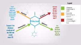
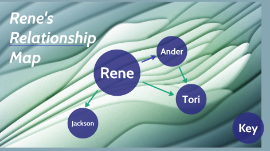
Transcript: Assets Relationship Map Template Chart Formatting Guide Comment Importance of Visualizing Relationships Purpose of the Chart Formatting Guidelines: Designing Your Relationship Map Visualizing relationships aids in understanding social networks, identifying key connections, and revealing patterns that facilitate effective communication and decision-making. The relationship map serves as a visual representation of interconnections among individuals, offering a comprehensive overview of various relationships. Visualizing Interconnectivity The lines connecting nodes illustrate the intricate connections between individuals, showcasing the depth and complexity of relationships in the network. Layout design, color coding system, and connecting lines style are crucial elements in creating an effective relationship map that clearly showcases interconnected relationships. Introduction to Relationship Map Template Layout Design Grouping Relationships for Clarity The layout design of the relationship map determines the arrangement and structure of nodes and connections, impacting the clarity and understanding of relationships. Grouping relationships based on categories or clusters can enhance the clarity of the relationship map, allowing for easier interpretation and analysis of the connections. Visualizing complex relationships through a structured chart can illuminate intricate connections and dependencies. Summary Color Coding System Nodes Representing Individuals Visualizing Connections in a Relationship Map Each node in the chart symbolizes an individual, depicting them as a central point within the network of relationships. Implementing a color coding system helps distinguish between different types of relationships or categories, enhancing the visual clarity and organization of the map. Effective layout design, color coding system, and connecting lines style are essential in creating a visual relationship map that conveys interconnected relationships clearly and efficiently. The network visualization of relationships presents a complex web of connections and interactions among individuals. Connecting Lines Style The style of connecting lines, such as line thickness or pattern, can indicate the strength or nature of relationships, providing additional context to the map. Including Descriptive Information Understanding Relationships Through Charts Incorporate additional details like the nature of the relationship, frequency of interaction, or shared interests. Descriptive information enriches the map by offering insights into the dynamics of each connection. Customizing the Relationship Map Visual representations offer a unique insight into complex relationships, showcasing interconnectedness in a clear and structured manner. Personalize your map to reflect unique connections and characteristics. Integrating additional elements can enhance the visual representation of relationships. Labels for Relationships Assign unique identifiers to different types of relationships, such as friends, colleagues, mentors, or family members. Clear labels help in easily understanding the dynamics between individuals. Reviewing the Completed Chart After creating the relationship map, review the layout for clarity, accuracy, and completeness. Ensure all connections are accurately represented, and data is up to date for a comprehensive overview. Adding Details and Labels Integrating Additional Elements Personalization Options Planning for Future Updates Enhance the map with icons, legends, or annotations to add context and clarity. Consider incorporating images, symbols, or notes for a richer visualization. Labels play a crucial role in defining relationships in the map, while descriptive information adds depth and context to each connection. Customize node shapes, colors, and sizes to signify different relationship categories. Utilize themes or templates to align with the map's purpose and audience. Regularly update the relationship map to reflect any changes in individuals' connections. Establish a maintenance schedule to ensure the chart remains current and relevant, adapting to evolving relationships and connections over time. Adding final touches... Thinking cap on... Fine-tuning... Write something high-impact about this photo This is where your presentation starts. Expand on the statement above. Polishing up... Write something high-impact about this photo Hang on... Getting it ready... A final point, a quote, more context — adapt the template to fit your needs. Remember that your presentation is almost done, so keep it simple Use this space for details that you haven’t talked about yet.


