Illustration Presentation
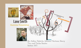
Transcript: Websites used: http://www.us.penguingroup.com/nf/Author/AuthorPage/0,,1000029880,00.html http://www.lanesmithbooks.com http://en.wikipedia.org/wiki/Lane_Smith_(illustrator) The End Illustrator Presentation Some other well known books Lane’s illustrated are: James and the Giant Peach, The Stinky cheese Man, The True Story of the 3 Little Pigs, Math Curse, and John, Paul, George & Ben. Lane worked as a janitor at Disneyland for 5 years to pay for college. He graduated from college with a B.F.A. and has since had a lot of award winning illustrations. His book Grandpa Green was recently awarded the Caldecott Honor Book and his book It’s a Book was recently on the New York Times bestseller list. Lane Smith was born in Tulsa, Oklahoma on August 25th, 1959. When he was three years old his family moved to California and he grew up there. But he went back to Oklahoma every summer, and says that most of his inspiration for his illustrations comes from those summers with his family when they’d drive on old route 66 to Oklahoma. He also has gotten a lot of his illustration ideas from childhood memories. Most of Lane's art is done in oil paints. He tends to use dark muted colors and sometimes multimedia. He especially loves unique textures, so between coats of paint he sprays the board with acrylic spray varnish. This causes a chemical reaction that makes a really cool a texture he likes. When he uses letters in his illustrations he likes to make them look like pictures or like a collage of words from a magazine or newspaper. For more information about Lane Smith, visit his website: By: Ashley Haderlie, Johanna Martinez, Sherry Yau, and Chelsie Bainter Section: 003 Lane Smith http://www.lanesmithbooks.com Hue: Lane Smith’s illustrations incorporate a very dark hue. Almost to give the reader the impression that it’s an older, or darker story than other children’s books. Color: Deep reds, greens, browns, and blacks. Shape: Triangles, squares, and circles. Space: Lots of depth. Many of them look over a vast landscape or down a long hallway. He makes this depth perception with the use of overlapping and different sized focal points. All kinds of crazy lines in his art, to create all different kinds of looks, from chaos right down to whimsy. Texture: Lots of texture. Some pages look as if the paper is cracked and wrinkled while other are covered in water marks and smudges. B.F.A.


