You're about to create your best presentation ever

Portal Powerpoint Template

Create your presentation by reusing a template from our community or transition your PowerPoint deck into a visually compelling Prezi presentation.

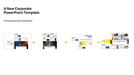
A New Corporate PowerPoint Template

Transcript: Photos Reusable assets A New Corporate PowerPoint Template Ante molestie mattis arcu gravida viverra adipiscing volutpat. Ultrices eget viverra eu lectus ullamcorper. Consequat dictum tristique lectus augue felis nascetur amet non. Velit sit placerat tincidunt integer amet massa justo risus netus. Ornare sagittis malesuada varius cursus ipsum erat libero metus eget. Colors Assets Developing Brand-Aligned Slide Designs 04 01 02 03 Title Aa Aa Subtitle S M W T T S F Paragraph Aa Aa Embedding Techniques Consistency Across Slides Importance of Branding Ensure the logo appears on every slide in the same manner to reinforce brand identity. Consistency in color, size, and position not only enhances professionalism but also aids audience recall. Use embedding techniques that ensure the logo remains intact across different devices and formats. Save the logo in high-quality formats such as PNG for transparent backgrounds, or SVG for scalability without loss of quality. Branding plays a crucial role in how an organization is perceived. Consistent use of visual elements, like the company logo and theme colors, fosters recognition and trust among clients and stakeholders. Slide Design Options Purpose of the Template Title Slide Design Logo Placement Guidelines Overview of Design Elements Visual Impact of the Logo This section covers essential elements for creating engaging slide designs that adhere to corporate branding. Each component plays a pivotal role in maintaining visual consistency and enhancing audience engagement. The primary purpose of the PowerPoint template is to standardize presentations across the company. By establishing a uniform design, each presentation contributes to a cohesive company image that aligns with our core values and mission. Position the logo in the top left corner of each slide for immediate visibility. Maintain sufficient padding around it to avoid visual clutter, ensuring it stands out while complementing the overall design. The title slide sets the tone for the presentation. Incorporate the corporate logo prominently for brand recognition, and use bold, legible fonts. Essential elements include the presentation title, subtitle, and date, ensuring clarity and professionalism without cluttering the slide. The logo acts as a visual anchor in presentations, enhancing brand awareness. A well-placed logo increases viewer trust and recognition, contributing to an effective communication strategy. The template integrates essential design elements such as a clear color palette, consistent typography, and appropriate use of imagery. Each element works in harmony to enhance readability and visual appeal, reinforcing brand identity. Examples of Best Practices Implementation and Feedback Utilizing Theme Colors Best practices include utilizing consistent fonts, aligning images and text uniformly, and adhering to brand colors. These practices not only enhance visual quality but also reinforce brand identity in presentations. Goals for Future Work Implementing a new corporate PowerPoint template requires strategic planning and open communication. Gathering team feedback is crucial for continuous improvement and ensuring that the template meets the needs of all users. Content Slide Variations Theme colors should reflect the brand’s identity. Use the primary colors such as red, blue, orange, green, and yellow consistently throughout the slides, ensuring that critical information stands out, especially in titles and headings. The aim is to continuously refine the PowerPoint template to meet evolving corporate needs. By incorporating feedback and including innovative design practices, the template will remain relevant and effective for all future presentations. Content slides should vary in layout to maintain audience interest. Utilize templates that allow for bullet points, graphics, or video inserts. Consistency in font, color, and logo placement across all content slides enhances the overall cohesive look. Rollout Strategy Continuous Improvement Collecting Team Feedback Image and Text Alignment The rollout strategy involves a phased implementation where team leads receive training first. This ensures that they can assist their teams effectively, maximizing the template's potential across the organization. Logo Integration Introduction to the Template Establishing feedback channels through surveys and meetings allows team members to share their experiences using the template. This direct input can guide future iterations and adjustments to enhance usability. Continuous improvement is key; analyze collected feedback and implement necessary changes to the template. Regular updates help maintain relevance and ensure the template evolves with the organization’s needs. Correct alignment between images and text is vital for readability and aesthetic appeal. Images should complement the text and not overwhelm it; maintaining balance helps convey the message effectively without distractions. This section

Patient Portal Template

Transcript: Patient Portal Utilization Meaningful use is using certified electronic health record (EHR) technology to: Improve quality, safety, efficiency, and reduce health disparities Engage patients and family Improve care coordination, and population and public health Maintain privacy and security of patient health information Meaningful use sets specific objectives that eligible professionals (EPs) and hospitals must achieve to qualify for Centers for Medicare & Medicaid Services (CMS) Incentive Programs. Two metrics: Patient Electronic Access 1: 50% target Measure 1: More than 50 percent of all unique patients seen by the EP during the EHR reporting period are provided timely access to view online, download, and transmit to a third party their health information subject to the EP's discretion to withhold certain information. Patient Electronic Access 2: 5% target For an EHR reporting period in 2017, more than 5 percent of unique patients seen by the EP during the EHR reporting period (or his or her authorized representatives) view, download or transmit to a third party their health information during the EHR reporting period. “When patients interact with their test results, they need to know the purpose of the test, the interpretation of the result, and next steps. Addressing these issues may help improve patient-centered care” (Baldwin, Singh, Sittig, & Giardina, 2016). References 2016 Program Requirements. Retrieved September 25, 2016, from https://www.cms.gov/Regulations-and-Guidance/Legislation/EHRIncentivePrograms/2016ProgramRequirements.html Baldwin, J. L., Singh, H., Sittig, D. F., & Giardina, T. D. (2016, October). Patient portals and health apps: Pitfalls, promises, and what one might learn from the other. In Healthcare. Elsevier. Eschler, J., Liu, L. S., Vizer, L. M., McClure, J. B., Lozano, P., Pratt, W., & Ralston, J. D. (2015). Designing Asynchronous Communication Tools for Optimization of Patient-Clinician Coordination. In AMIA Annual Symposium Proceedings (Vol. 2015, p. 543). American Medical Informatics Association. Heyworth, L., Paquin, A. M., Clark, J., Kamenker, V., Stewart, M., Martin, T., & Simon, S. R. (2014). Engaging patients in medication reconciliation via a patient portal following hospital discharge. Journal of the American Medical Informatics Association, 21(e1), e157-e162. Snyder, E., & Oliver, J. (2014). Evidence based strategies for attesting to Meaningful Use of electronic health records: An integrative review. Available in the. Online Journal of Nursing Informatics (OJNI), 18(3). Wade-Vuturo, A. E., Mayberry, L. S., & Osborn, C. Y. (2013). Secure messaging and diabetes management: experiences and perspectives of patient portal users. Journal of the American Medical Informatics Association, 20(3), 519-525. Wilcox, L., Patel, R., Back, A., Czerwinski, M., Gorman, P., Horvitz, E., & Pratt, W. (2013, April). Patient-clinician communication: the roadmap for HCI. In CHI'13 Extended Abstracts on Human Factors in Computing Systems (pp. 3291-3294). ACM. Stage 3 and MACRA Meaningful Use and the Patient Portal Literature “regular internet use and having a personal computer partially accounted for differences in use of the portal to send messages to health care providers by age, race, and income, whereas education and sex-related differences remained statistically significant even after controlling for internet access and care preference” (Graetz, Gordon, Fung, Hamity, & Reed, 2016). Meaningful Use Usability and Functionality Wanjiku Kariuki Viola B. Leal Mohammad Tabatabai Ana Ibarra Noriega MyUofMHealth.org Secure Messaging “over two-thirds had at least one medication discrepancy at discharge, and nearly one-third had at least one potential ADE” (Heyworth et al., 2014). The authors found that “virtual medication reconciliation following hospital discharge has the potential to improve medication safety in the transition from inpatient to outpatient care” “more effort on the part of the provider is needed to encourage patients to use a portal system. If providers take a more active role in educating patients as to the benefit of the portal, provide a positive view of the system, provide consistent standardized information, and remind the patients in multiple ways and times, patients are more likely to enroll in the portal system” (Snyder & Oliver, 2014). Objective 8: Patient Electronic Access (VDT) Provide patients the ability to view online, download, and transmit their health information within 4 business days of the information being available to the EP. Patient Portal Metric Provider Buy-in Portal on Newer Internet Browser Lab Test Results DMC Patient Portal “patient and provider attitudes toward patient portal use found that the most negatively-perceived feature was user-friendliness, making the portal difficult to navigate” (Baldwin, Singh, Sittig, & Giardina, 2016). “When patients interact with their test results, they need to know the purpose of the test, the interpretation of the

Islamic Style PowerPoint Template Design

Transcript: Importance of Natural Light Natural light is not only valued for its aesthetic appeal but also for its spiritual significance. In Islamic architecture, elements like large windows and skylights are designed to invite sunlight and promote a sense of tranquility and connection with nature. Types of Lighting Fixtures Decorative Lighting Techniques Techniques such as using colored glass, intricate wood carvings, and patterned screens create captivating lighting effects in Islamic interiors. These techniques soften light and enhance the beauty of the architectural features, creating a unique ambiance. Islamic interiors utilize a variety of lighting fixtures, such as lanterns, sconces, and chandeliers. These fixtures often showcase intricate designs, featuring geometric patterns and calligraphy, reflecting the rich cultural heritage of Islamic architecture. Geometry and Symmetry Patterns and Motifs Traditional Color Schemes Common Materials Used Patterns in Textiles Geometry in Islamic architecture plays a pivotal role, symbolizing the infinite nature of the universe. Symmetry is employed to create balance and harmony, often seen in mosque layouts and decorative elements, enhancing the spiritual experience for visitors. Islamic design traditionally uses rich jewel tones such as emerald green, deep blue, and ruby red, often contrasted with gold and white accents. These colors are deeply rooted in cultural and religious significance, symbolizing peace, spirituality, and nature. Islamic patterns and motifs serve both decorative and symbolic purposes, representing unity, eternity, and the divine. These designs are characterized by intricate repetitions and are commonly found on tiles, walls, and textiles, creating a mesmerizing visual experience. Spatial Layout and Functionality Calligraphy Islamic interiors often feature textiles made from natural fibers such as cotton, silk, and wool. These materials are not only durable but also contribute to a warm, inviting atmosphere. Additionally, the use of intricate embroidery and embellishments adds depth and visual interest to the fabrics employed in these designs. Multi-functional Areas Psychological Effects of Color Islamic textiles are characterized by geometric patterns, floral motifs, and intricate designs that symbolize paradise and spirituality. The repetitive nature of these patterns reinforces the harmony in Islamic art and can be used to create a sense of rhythm within a space, making the interiors dynamic and engaging. The spatial layout in Islamic interior design reflects cultural values and enhances functionality. A balance between open and closed spaces facilitates movement and interaction while offering privacy. Color Palettes in Islamic Design Designing multi-functional spaces allows for versatility, adapting to various guest needs. Features like convertible furniture or flexible layouts can transform a lounge into a conference area, enhancing usability and maximizing space. Lighting in Islamic Interiors Colors influence mood and behavior significantly. In Islamic design, green evokes tranquility and harmony, while red can represent power and passion, enhancing the overall experience in resort hotels by creating specific atmospheres. Calligraphy is a revered art form in Islamic culture, used to convey sacred texts and enhance architectural beauty. The use of Arabic script embellishes walls and spaces, merging art with spirituality and serving as both decoration and communication of faith. Color plays a significant role in Islamic design, invoking cultural meanings and enhancing the aesthetics of interior spaces. The application of traditional color schemes influences emotional responses and creates a unique ambiance in resort hotels. Key Elements of Islamic Architecture Open vs. Closed Spaces Flow and Movement Open spaces promote community and foster interaction among guests, suitable for lobbies and communal areas. Closed spaces, such as private suites, offer tranquility and personal retreat while maintaining a connection to the overall design theme. A well-designed spatial layout ensures seamless flow, guiding guests naturally through the space. Consider integrating pathways that connect different areas, enhancing the guest experience by facilitating ease of movement without congestion. Color Combinations Islamic architecture is characterized by its intricate use of geometric patterns, symmetry, and elegant calligraphy, forming a unique aesthetic that reflects spiritual beliefs and cultural identity. Understanding these key elements is essential to appreciate the depth and beauty of Islamic design in contemporary settings. Incorporating Fabrics into Design Effective color combinations in Islamic design often include complementary and analogous schemes. For instance, combining turquoise with warm beige creates a serene yet inviting space, essential for resort hotel aesthetics. Fabrics can be strategically integrated into Islamic interior spaces through

Now you can make any subject more engaging and memorable