You're about to create your best presentation ever

Metrics Dashboard Powerpoint Template

Create your presentation by reusing a template from our community or transition your PowerPoint deck into a visually compelling Prezi presentation.

Medical PowerPoint Template

Transcript: Medical PowerPoint Template Design Elements Color Schemes for Medical Presentations Font Selection for Readability Color schemes significantly affect audience understanding and retention. In medical presentations, using blue and green hues promotes calmness and trust, while contrasting colors can highlight key information and enhance visibility. Choosing the right font is crucial for comprehension. Sans-serif fonts like Arial or Helvetica are recommended as they are easier to read on screens. Always ensure that text is large enough to be legible from a distance. Incorporating Graphics and Images Layout and Structure Incorporating relevant graphics can enhance understanding and retention of complex ideas. Use high-quality images, charts, or diagrams that directly relate to the content to support the narrative without overcrowding the slide. A well-structured layout guides the audience’s eye and improves information flow. Utilize a grid system to maintain alignment and consistency, making sure to reserve space for visual elements. Balance text with images to avoid clutter. A Blank Canvas for Your Data Presentation Tips Best Practices for Delivery Content Organization in Medical Presentations Engaging Your Audience Practicing your presentation can lead to smoother delivery and reduced anxiety. Utilize appropriate body language, voice modulation, and eye contact to foster a connection with the audience, making your message more impactful. Audience engagement is critical for effective communication. Techniques include asking rhetorical questions, using relatable examples, and incorporating multimedia elements to maintain interest and encourage participation. Title Slides and Headings Introduction to Medical Presentations Title slides set the stage for your presentation and should include the topic, your name, and the date. Headings throughout the presentation guide the audience through the narrative and facilitate smooth transitions between topics, ensuring clarity and focus on key messages. Bullet Points vs. Paragraphs Handling Questions and Feedback Bullet points provide concise and digestible pieces of information, making it easier for the audience to follow along. In contrast, paragraphs may be necessary for complex concepts but should be used sparingly to maintain attention and avoid overwhelming the viewer. Practicing and Timing Your Presentation Using Tables and Charts Tables and charts effectively present quantitative data, making complex information more approachable. They facilitate quick understanding of trends and relationships within data, enhancing the audience’s ability to interpret clinical findings or statistical results. Rehearse your presentation multiple times to refine your delivery and timing. Understanding how long each section takes helps ensure that you cover all material without rushing or exceeding your allotted time. Encourage questions to create a dialogue with your audience. Responding thoughtfully to feedback shows respect for their input and enhances clarity for everyone involved, improving overall comprehension. Citing Sources and References Importance of Visual Aids Citing sources is crucial in maintaining credibility and allowing the audience to explore further. Proper referencing not only attributes the original work but also strengthens arguments presented in the medical content, supporting evidence-based practice. Visual aids play a crucial role in medical presentations by simplifying complex information. They help audiences grasp essential concepts quickly, improving retention and engagement through the use of charts, images, and videos. Overview of PowerPoint Features PowerPoint offers various features to enhance medical presentations, including templates specifically designed for medical content, the ability to incorporate multimedia, and options for animations that can illustrate processes or changes over time. Objectives of the Medical Template The medical PowerPoint template serves to streamline the creation of presentations by providing a standardized format. This ensures consistency in design and aids users in organizing their data effectively for clarity and impact.

SIP Presentation

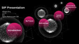
Transcript: Wong Li Ong 22791 BIS Agilent Technologies LDA SIP Presentation SIP Presentation Wong Li Ong BIS 22791 Introduction Project Titles Project Some of the projects I have done ATP Report (Automation) Dashboard Automation System ATP Report Automation Auto pull data from SAP Auto Send email to specific recipient CRDD Pre-Alert Report CRDD Pre-Alert Report Auto pull data from SAP CRDD Tools CRDD Tool Automated converting of Excel Charts to PowerPoint Dashboard Automation System Help users to create the dashboard My SIP My Project Dashboard Automation System Problem Statement THE PROBLEM Don't have visualization platform Time-consuming Difficulties in root cause analysis Objectives Objectives Data Visualization Acts an performance and metrics tracker (KPI) To track the trend and plan for forecast Example of Dashboard in Excel Methodology Waterfall Model Requirements Gathering Step 1: Requirements Gathering Discuss with my buddy about the necessary requirements of a dashboard Self-learning to explore the function of a dashboard that used for analysis purpose Design Automation template Step 2: Design of Automation Template This automation template enable users to create dashboard based on their data sources Automation Template Implementation #1 #2 #3 Step 3: Implementation Working File Pulling data from SAP Dashboard Automation System Phases Phases of this System Phase 1 Phase 1: Data Source Pull data from SAP(Automation) Matching data from different files Raw Data ready for creating dashboard Data from SAP Data match from different file Phase 2 Phase 2: Dashboad Designing Enable users to create 2 dashboard Enable users to choose number of charts and chart type Enable users to preview the chart type Insert Slicer for data filtering Dashboard Created Enable users to write the comment at the textbox provided Few buttons with function provided at the dashboard Automation Template Dashboard Page User Guidlines User Guidelines Step 1: Open workbook with data sources Step 2: Select number of charts Step 3: Select data fields & chart type Step 4: Select Slicer(Optional) Step 5: Press "Create dashboard" button Automation Template Dashboard Workbook Demo Demo Conclusion & Recommendation Conclusion & Recommendation Conlusion Conclusion What I have learnt? Improve my programming skills Supply Chain knowledge such as on time delivery and SAP function Data Analysis skills Impact of this System Improve the data visualization process Automated some process to minize the manual jobs & avoid human error enable users to track the KPI and historical performance Before VS After 10 minutes VS 30 seconds Non-standardized steps VS Standardized steps Not flexible VS Flexible Recommendation Recommendation Able to create combochart Able to refresh data with one click Working file automation Phase 3 (Big Data Connection) Interactive & Predictive Analysis Q & A

Analytics, Metrics and Dashboard Process

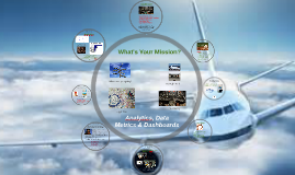
Transcript: Determine the drivers Report on each driver regularly Tweak the equation Find better fuel Find more efficiency Facilitate the right question Help decide what to predict Assist with data mining Help create an equation Interpret the drivers and weights Find dashboards that predict Tell the story What's the "one" thing? Analytics "They are asking all the wrong questions. And if I say it to anybody, I'm ostracized. I'm a leper. So that's why I'm cagey about this with you." This is where most attempts fall short Dependent Variable (what you're predicting) What data do you have? Where are you going? Part 1 “They are asking all the wrong questions.” Moneyball Flight Plan What data do you need? Analytics, Data Metrics & Dashboards A pilot cares about 4 or 5 gauges, the rest are there "just in case". Can I Help? What does the data tell you? The Right Fuel Monitoring If you know what to predict (dependent variable) then finding what beta weights that "drive" the equation is easy peasy..... BUT Where are you going? Where are you going? Part 2 Location So? If you had magic crystal ball, what would you most like to predict? What keeps you up at nite? What does your boss look at most closely? "People who run ball clubs, they think in terms of buying players. Your goal shouldn't be to buy players, your goal should be to buy wins. And in order to buy wins, you need to buy runs." Data Mining Dashboard Drivers (Dashboard Wannabes) Curly: Do you know what the secret of life is? Curly: This. Mitch: Your finger? Curly: One thing. Just one thing. You stick to that and the rest don't mean *$&%. Mitch: But, what is the "one thing?" Curly: That's what you have to find out. – City Slickers Summary Ask the right question Decide what you want to predict Find the best data to predict Find the right tool to predict Train the right data owners Create a good equation Make the dashboard Continually improve Tools Head count needed? Lifetime value? Customer satisfaction? Department value? Controlling spend? Understanding our customers? Processing the raw materials The Right Fuel If you can make a picture of the situation, then more people will understand. Tell the Story Tips to Get Started Start with your own gold Get a professional data geologist Find the right tools Process the data Flight Plan What's Your Mission? Focus on the data that affects your prediction with the weights provided by analysis Mind mapping Data visualization Graphical facilitation Thought maps

Human Capital Metrics Dashboard

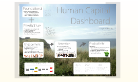
Transcript: headcount gender profile hierarchy structure leadership groups age profile etc Agree an approach Small team to design metric 1 F&A + 1 P&L owner from AUST and EMEA Initial test in Australia & EMEA Present approach to HRGC Adapt for Global context Aim for FY13 implementation value added per employee minus average cost per employee times workforce size (# of employees) Already measured globally Focus on robust numbers Alignment of definitions Roll into Seth's initiative Productivity People Productivity Quantify effort required to calculate new measure Test for so what Pilot usefulness as measure to improve productivity Report findings to HRGC An Example: Retention Foundational Metrics: Many approaches used globally Focus for this initiative Agree an approach Service Profit Chain as framework Kick off with 3 key metrics Use Global Mercer Measure Annual remeasure Add quarterly barometer measure One or two questions only Poll 1/4 of employees each quarter Circulate draft definitions for Voluntary Turnover measure by email for input Work wit hSeth to deploy globally Human Capital Dashboard Engagement + Retention Here is something small... Next Steps: Engagement: Human Capital Dashboard Predictive So... HRGC agree on quarterly measure Talk to India re: how to deploy quarterly measure 30 Next Steps: Productivity New metric Consider Boston Consulting Group "Workonomics" framework 3 levers of "people" productivity Isolate employee- generated revenue Engagement Foundational Use Turnover Measure 12mth voluntary rolling turnover Measured monthly Agree definition for "voluntary" Next Steps: Retention Service Profit Value Chain Predictive Metrics:

Now you can make any subject more engaging and memorable