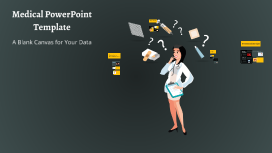
You're about to create your best presentation ever

Inspirational Powerpoint Template Design

Create your presentation by reusing a template from our community or transition your PowerPoint deck into a visually compelling Prezi presentation.

Medical PowerPoint Template

Transcript: Medical PowerPoint Template Design Elements Color Schemes for Medical Presentations Font Selection for Readability Color schemes significantly affect audience understanding and retention. In medical presentations, using blue and green hues promotes calmness and trust, while contrasting colors can highlight key information and enhance visibility. Choosing the right font is crucial for comprehension. Sans-serif fonts like Arial or Helvetica are recommended as they are easier to read on screens. Always ensure that text is large enough to be legible from a distance. Incorporating Graphics and Images Layout and Structure Incorporating relevant graphics can enhance understanding and retention of complex ideas. Use high-quality images, charts, or diagrams that directly relate to the content to support the narrative without overcrowding the slide. A well-structured layout guides the audience’s eye and improves information flow. Utilize a grid system to maintain alignment and consistency, making sure to reserve space for visual elements. Balance text with images to avoid clutter. A Blank Canvas for Your Data Presentation Tips Best Practices for Delivery Content Organization in Medical Presentations Engaging Your Audience Practicing your presentation can lead to smoother delivery and reduced anxiety. Utilize appropriate body language, voice modulation, and eye contact to foster a connection with the audience, making your message more impactful. Audience engagement is critical for effective communication. Techniques include asking rhetorical questions, using relatable examples, and incorporating multimedia elements to maintain interest and encourage participation. Title Slides and Headings Introduction to Medical Presentations Title slides set the stage for your presentation and should include the topic, your name, and the date. Headings throughout the presentation guide the audience through the narrative and facilitate smooth transitions between topics, ensuring clarity and focus on key messages. Bullet Points vs. Paragraphs Handling Questions and Feedback Bullet points provide concise and digestible pieces of information, making it easier for the audience to follow along. In contrast, paragraphs may be necessary for complex concepts but should be used sparingly to maintain attention and avoid overwhelming the viewer. Practicing and Timing Your Presentation Using Tables and Charts Tables and charts effectively present quantitative data, making complex information more approachable. They facilitate quick understanding of trends and relationships within data, enhancing the audience’s ability to interpret clinical findings or statistical results. Rehearse your presentation multiple times to refine your delivery and timing. Understanding how long each section takes helps ensure that you cover all material without rushing or exceeding your allotted time. Encourage questions to create a dialogue with your audience. Responding thoughtfully to feedback shows respect for their input and enhances clarity for everyone involved, improving overall comprehension. Citing Sources and References Importance of Visual Aids Citing sources is crucial in maintaining credibility and allowing the audience to explore further. Proper referencing not only attributes the original work but also strengthens arguments presented in the medical content, supporting evidence-based practice. Visual aids play a crucial role in medical presentations by simplifying complex information. They help audiences grasp essential concepts quickly, improving retention and engagement through the use of charts, images, and videos. Overview of PowerPoint Features PowerPoint offers various features to enhance medical presentations, including templates specifically designed for medical content, the ability to incorporate multimedia, and options for animations that can illustrate processes or changes over time. Objectives of the Medical Template The medical PowerPoint template serves to streamline the creation of presentations by providing a standardized format. This ensures consistency in design and aids users in organizing their data effectively for clarity and impact.

Template Design

Transcript: Definition of Templates Templates are standardized formats used to create documents, presentations, and projects. They offer a consistent layout, making it easier for users to add content without starting from scratch. Examples of Successful Templates Corporate Presentation Templates Introduction to Templates This section highlights various successful presentation templates across different sectors, showcasing how tailored designs can enhance communication effectiveness. Each category serves distinct purposes, from corporate strategies to educational insights and creative showcases. Templates are pre-designed layouts that provide a structured format to present information efficiently. They play a vital role in enhancing productivity and maintaining consistency in design across various types of content. Corporate presentation templates are designed to convey professionalism and clarity. They often include structured layouts, brand-consistent colors, and infographics that support data-driven storytelling, making them suitable for annual reports and stakeholder meetings. Importance of Templates Creative Presentation Templates Types of Templates Creative templates emphasize artistic design and originality, often incorporating vibrant colors, unique fonts, and imaginative layouts. These templates are ideal for startups, creative agencies, and individual portfolios, allowing for personal expression and storytelling. Utilizing templates enhances efficiency by reducing design time and ensuring uniformity. They help reinforce branding while allowing users to focus on content rather than layout. Templates come in various forms, including business presentations, educational slides, and creative designs. Each type is tailored to specific needs, ensuring effectiveness in communication. Educational Presentation Templates Educational templates are tailored for lectures, seminars, and workshops, typically featuring interactive elements and visual aids like diagrams. Their focus is on facilitating learning, making complex information accessible to students and audiences alike. Template Design Collaboration Tools Online Resources Effective collaboration tools such as Google Slides and Trello facilitate teamwork in template design. Google Slides allows multiple users to edit templates simultaneously, while Trello helps organize tasks and feedback, ensuring a streamlined workflow and improved communication among team members. Numerous online platforms provide templates and resources, such as Envato Elements, where users can access pre-designed templates across various categories. Websites like Template.net and SlidesCarnival also offer free and premium options, significantly speeding up the design process and ensuring a polished final product. Software Options Crafting Effective and Engaging Presentation Templates Several software solutions are integral for creating templates, including Adobe Illustrator for its advanced design capabilities, Microsoft PowerPoint for its user-friendly interface, and Canva for its extensive template library and ease of use. These tools offer various features catering to different design needs, making them invaluable for template creation. Layout and Structure An effective template layout ensures a logical flow of information. Key elements include balance, alignment, and spacing, all of which facilitate readability and comprehension. Using a grid system can help maintain alignment and consistency throughout the presentation. Tools for Creating Templates Modern template design relies on a variety of dedicated software and online resources. Utilizing the right tools enhances efficiency, creativity, and collaboration throughout the template development process. Color Schemes Designing Effective Templates Choosing an appropriate color scheme can significantly influence the audience's emotions and perceptions. Effective color combinations create contrast, enhance readability, and convey branding. Common strategies include using complementary, analogous, or monochromatic color palettes to achieve desired effects. Creating effective templates requires a careful focus on layout, color schemes, and typography to engage and communicate with the audience strategically. Optimal design choices can enhance the template's usability and ensure the intended message is delivered clearly. Typography Typography plays a crucial role in setting the tone of a template. Selecting fonts that are both legible and on-brand enhances the message's effectiveness. Considerations include font pairing, hierarchy, and spacing, which can all markedly impact audience engagement and comprehension. Summary of Key Points Templates are vital tools that streamline communication and organize information effectively. Key takeaways include their importance in enhancing professionalism, ensuring consistency, and fostering creativity across various applications. Emerging Trends in Template Design Consistency in Design Template design is

Effective Powerpoint Design

Transcript: Which Linearity to Choose? What is Linear vs Non-Linear? This title is far too dark for this background Linear or Nonlinear References There is nothing inherently wrong with either one, they just serve two very different purposes. Nonlinear allow for an easy presentation of multiple subjects or sub-categories, not always related, such as general design tips and linear vs nonlinear comparison. It allows an easier intractability to refer back to past information. Easy to integrate audience participation. Linear is effective at portraying a clear single subject or goal Timing is generally very predictable and easy to plan. Easy to summarize points or imparting facts. Conclusions Effective Presentation Design Nonlinear Presentations This text should probably be split up into different sub points via bullets but instead I’ve made an unsightly wall of text that is visually overwhelming and distracting to those that are viewing the presentation. The lack of spaces and overuse of text rather than outlining and allowing for the oral presentation to fill in the details also muddles the overall effect of the presentation. Overuse of wacky transitions and overly long animations is incredibly distracting when presenting information. Colors such as light blue or light yellow should probably be avoided for those with color blindness. Besides too many pictures, many are covering text or serve no real purpose. Each design of presentation isn’t good or bad, just used for a different purpose. Linearity is focused on fact presentation. Nonlinearity is focused on interactivity and flow. Slide design should conform to design standards. Color should stand out against the backdrop but not be blinding. Maintain a color scheme throughout for cohesion. Over use of transitions and animations is a major distraction. Having text structured makes it more clear. This being underneath and smaller text provides hierarchy and shows this is a related point. This also allows the view a clear means of identifying what you’re talking about. Clarity in text contrast and pictures to assist but not clutter is key to good design. This white, for example, shows well against the red backdrop. Ensuring images don’t cover text is also important. Good Keeping it structured and outlined. Use bullets to show what points are subordinate to overarching statements Especially for voiced presentations, don’t include every word you wish to say in the text, just outline the points. Light transitions and low stylization. Transitions can keep a presentation interesting as long as it’s not overly utilized. Use of pictures or video (non-autoplay) to support your point. Linearity allows for a step-by-step structured series of slides most effective in conveying facts or information that has little need for audience participation. Despite the transitions making it seemingly non-linear, this presentation is linear, as it follows a fixed path. Good and Bad Design Choices Thank you! We will discuss the best ways to make the best presentation possible. Picking between a linear or nonlinear style. Effective means of conveying a message. Pitfalls many presentations succumb to. Nonlinearity tools like prezi greatly help in managing clutter. The ability to zoom into smaller text allows it to not take up space on previous slides. Transitioning to focus on a video or picture is also very easy with varying slide sizes. Good Example Linear and Non-Linear Ways to Make the Best Presentation Linear Follows a set path going forward from slide to slide. Can’t go back to a previous slide. Generally forces conclusions for a section to be at the end. Uncomplicated, but that’s okay. Non-Linear Can reference back to past slides more easily. Can jump only to certain slides of information. Link between slides more similar to a website. Effective for unguided presentations. Now that you have an idea of which type of presentation to choose, slide design is also important. Many powerpoints stumble because of ineffective or overly cluttered design. Many mistakes come at the most fundamental level, making the wrong type of presentation. Being able to identify if it’s a simple, single message or user interactivity is key in initial design choice. Over-focus on nonlinearity in a powerpoint that really only needs to be a linear summary can seem overly complex. Linearity can be perceived as boring. This text has high contrast to the background By David Rosenberg How to Make an Effective Presentation Presentation Best Practices Knickerbocker, Vicky, and Brent Olsonawski. "The Good, The Bad, and The Ugly: Powerpoint Basics." Inverhills. N.p., n.d. Web. 17 June 2014. <https://www.inverhills.edu/StudentSuccessDay/pdfs/TheGoodBadandUglyPowerPointBasics.pdf>. "Microsoft PowerPoint 2003." PowerPoint 2003: Linking and Branching, UWEC. N.p., n.d. Web. 17 June 2014. <http://www.uwec.edu/help/PPoint03/lnkbrch.htm>. "Non-linear PowerPoint Presentation." Non-linear PowerPoint Presentation. N.p., n.d. Web. 17 June

Inspirational Design

Transcript: Designers take inspiration from many different things...... Ideas can be formed observing the world around us...... Modelling is a way of generating, developing and refining a design idea. Like sketching it lets you communicate your ideas to get feedback, it also lets you think about your ideas in a different way. It can also allow you to reshape and re-design without affecting the final outcome. Reproduction Honeycomb Butterfly Inspirational Design Plenary: LO3: LO2: Leaf Tree Nature glue What resources can we use to gather research? What are the benefits of modelling? If you were to create a design for an original light how might you go about it next time? How did you modify your light to improve the design Film Using nature as your inspiration, can you create a model of a creative light in 30 minutes? Go!!! In 2 minutes can you create a quick design for a light? hole punch Another way we can create design ideas is through modelling......... Can you create an isometric drawing, or an orthographic projection of your model light? Can you add features or modifications to improve it? Music Students will learn how designers create imaginative ideas Platypus Lotus Flower Lesson Objectives scissors Once a designer has done some research, what is the next part of the design process? straws Religion Students will use original ideas to create their own unique product Bonsai Tree Take a look at these products, do you recognise where the designer has taken their inspiration from? sellotape LO1: You each have access to: Where else might designers get inspiration from? If you have created your model can you create a drawing of it? Dreams We can create some quick sketches........... Students will use modeling to create an original design solution String Elephant 2 pieces of card Design task: Shell Books Internet Tagliatelle Biomimicry Inspiration??? Armadillo

Template Design

Transcript: Motivation Motivation Advantages both economically and politically. Influence public opinion, thus the ability to impact societal perceptions and even shape policy decisions. Can work as a framework for policymakers, social media platforms, and civil society to monitor and respond to the evolving landscape of political discourse. Keep your words short and punchy so your audience stays focused. You can add imagery and frames to keep their attention where you want it. Methodology A pipeline with 5 stages+ Data A pipeline with 5 stages+ Stage.1: Preprocessing Stage.2: Topic Modelling Stage.3: Event Detection Stage.4: Story Extraction Stage.5: Competing Narratives Detection 1.2 million tweets of European politicians extracted from Twitter for the period from January 1, 2022, to December 31, 2022. Tweets are narrowed down to tweets authored by German speaking politicians in 2022. Extracted tweets attributes: 'id', 'user-id', 'date', 'text', 'lang', 'translation' and 'sentiment'. Map of user party affiliation, which includes user IDs and their corresponding party affiliations. (Source: Wikidata) Put a bold statement here Use this space for details that you haven’t talked about yet. Relate what you’re saying to the nearby image so your audience has a visual, too. Use this for a powerful quote or statistic. Content Motivation Introduction.. Data. Method. Evaluation. Conclusion. Automated Identification of Competing Narratives in Political Discourse on Social Media Ahmad Hamadeh Hannover, den 15. Mai 2024 Conclusion

Now you can make any subject more engaging and memorable