Academic Poster
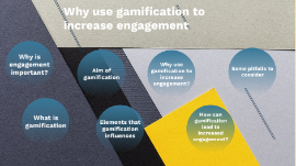
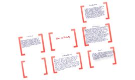
Transcript: POSTGRADUATE CONFERENCE RESEARCH PROJECT ACADEMIC RESEARCH POSTER - GOOD PRACTICE OBJECTIVES # OBJECTIVES How to plan your academic poster Good design practice for academic posters Getting Started SCRIPTING Before you consider any other design software, open Microsoft Word. Any word processor will do, but make sure that it has the ability to track your word count and checks your spelling. TARGET AUDIENCE Ask yourself, who is my ideal audience for this poster? Is it other experts in your field, or perhaps the broader public? What is their level of understanding of the subject? This is an important question because if you put a bit of effort into making your poster understandable to the broader public, you automatically increase your potential audience and impact. BULLET POINTS A poster should not look like a paper, therefore, bullet points are your friend. 200-word paragraphs on a poster would discourage even the most motivated, sober, and caffeinated conference attendant. Bullet points on the other hand are a lot less frightening. There is a trend among some academics to slap a solid 200-or-so word abstract right at the top of their posters. Your whole poster is a VISUAL abstract SECTIONS Use sections with headers. Because we are writing with the reader in mind, we want to make the logical flow of the sections as easy as possible for the viewer to follow. My advice is to have large LESS WORDS Less words. The harsh reality is that if your poster is wordy, people will ignore it. Less is definitely more. GRAPHS You need to leave most of them out. You need to carefully select only the very essentials. One or two graphs is better than three or four, and certainly better than eight or nine! STEP 2: CONCEPT Here is where the fun starts. Grab a piece of paper, or open up your design software, and make a first draft. THINK ABOUT A VISUAL CONCEPT PANELS How do we read, left to right or right to left? Top-down or bottom-up? It may seem obvious, but I always see posters that are visually confusing and don’t have a clear directional flow. Start with an enlarged and readable title right at the top, then create a simple layout of panels that make it easy for the viewer to navigate. Remember that we’re committed to keep the reader in mind, so use arrows and numbered headers to help them out. LEAVE SPACES AT THE EDGES Notice the grey space in the images? It’s important to leave some blank space around the edges for a couple of reasons. First, you don’t want to risk important information to be cut off when printing, and second, you don’t want your poster to feel cluttered. This blank space is also known as negative space, and we’re going to unpack this concept more in the next section. STEP 3: DESIGN STEP 3: DESIGN NEGATIVE SPACE Negative space. For some strange reason, many academics feel the need to cover every inch of their poster with text or images. This is the wrong idea! It’s bad because it makes it difficult for the viewer to find the relevant information and to rest their eye. Clear space, also known as negative space, is an super important design concept, one that you should use to your advantage. 40% of your poster should be clear. EYE-CATCHING VISUALS Imagine you’re walking around a poster session, and you’re far enough away from the posters that you can’t read titles or graphs. What will compel you to walk towards a particular poster? It’ll likely be a recognisable image that grabs your attention. Without a big and recognisable image, your poster will look like a fuzzy wall of text and it will likely go unnoticed. Therefore, it’s smart to include one big visual that’s related to your research and has the ability to hook people in from a distance. Be it a rocket, a lion, or an octopus — what matters is that it’s there. COLOUR COLOUR Use a limited number of colours, say three-to-five, and stick with them! Graphs included. My suggestion is that you have two or three shades of a primary colour of your choice, an accent colour that stands out, and a couple of text colours. In a colour scheme of this kind, you can use the accent colour to draw attention to where you want people to look. The important thing is that you use the accent colour in moderation. Let me show you what I mean. COLOUR BACKGROUND IMAGES? FONTS Fonts and font sizes work a bit like colours. That is, the fewer you use, the better. My suggestion is to use only one or two different fonts. Boldface should be used on titles and headlines, while all the rest should be normal. When picking what fonts to use, play it safe. Stick with the classic Arial, Myriad Pro, and other familiar fonts and you can’t go wrong. SOFTWARE Canva (Free online graphics tool) Microsoft PowerPoint Adobe InDesign? Introducing Canva GO TO WWW.CANVA.COM NEXT Next Week's Session Be able to navigate the Canva workspace Be able to use elements creatively to update and adapt poster templates Be able to use templates to create a professional poster outlining your innovative process