You're about to create your best presentation ever

Free Powerpoint Template Great Diagrams And Charts

Create your presentation by reusing a template from our community or transition your PowerPoint deck into a visually compelling Prezi presentation.

Using Graphs, Charts, And Diagrams

Transcript: @Ryan and @Patrick Circle Graphs Data is usually given in these forms and portrayed in one that helps prove their point whether that be through a pictograph, or circle graph. Line and Bar graphs are good at comparing multiple things or results over time, as these are able to easily do these things in a organized manor that is easy to read. Line graphs are also especially good at measuring money or high quantities. Circle graphs are great for showing the whole information because it is divided into parts. Usually a circle graph is short for pie graph because it can be cut into parts known as percentages or fractions. Charts Climographs are good at displaying 2 types of data for 2 different items, as they are a mix between a line and bar graph. They are usually seen measuring the size of snow, or the temperature of a certain place. Climograph Graphs are a simple and easy way to display data visually. They seem simple, but a lot goes into both making them and reading them. End Summary Line and Bar Graphs Pictographs Bibliography Diagrams would be used to show steps in a manageable way so it is more useful. It also can explain how something will work. Diagrams Graphs Using Graphs, Charts, And Diagrams Charts are very useful because they sort the numbers or facts in an organized fashion. Its useful because you can easily arrange the data into columns and see your information. Geography handbook- info Google - Images These graphs are usually good at comparing, and will almost always use symbols related to the subject to help you visualize the idea, instead of boring lines or bars. They will have a "Key" Used to identify what means what and how much. Just for example, it could say "How many apples were sold in February than March?" So by using a pictograph you can tell whether or not the amount of items you sold was higher than the following month or less. Thank you!

Group 4 Charts and Diagrams

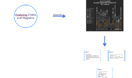
Transcript: Goal: To stop the undue influence of money from corporations, the wealthy, and third party sources in federal elections, while strengthening the democratic election process. Plan: Propose and pass a new amendment to the Constitution which clearly outlines the federal voting process, voting rights as well as permanently restrict and/or stop all but private citizens from donating moderate sums to candidates or political parties Criterion 1: Steer federal elections back toward a more purely democratic affair to help strengthen our government and return confidence in our system of government. How Criteria Meets Plan: By passing this amendment, and limiting outside influence or corruption from the vast financial power of corporations and the wealthy, peoples opinions about government will change. It will also facilitate the need for candidates to actually campaign to the masses, and then follow through with their promises, by representing the constituents whom they are responsible to. Criterion 2: The second criterion is to remove the ability of the wealthy and corporations via lobbying to influence politicians during elections and while in the course of their duties. How Criteria Meets Plan: Place a permanent limit on the all monetary, material, or donation of services by any private citizen to a total of $10,000 US annually. This information will be public record and anonymous donations would be prohibited. Criterion 3: Remove Corporate financial influence from elections and ties to federal politicians both directly and through 3rd party fundraising systems to influence candidacy and elections. How Criteria Meets Plan: : Permanently bar by amendment to the US constitution all monetary donations, material donations, or donations of time/services to any candidate for election to a federal seat, which originate from a public or private corporation of any type. Criterion 4: Stop the influence of all 3rd party political fundraising entities such as PACs, SuperPACs, trusts, and political party general donation pools, or any 3rd party organization which is not currently deemed a public charity under Section 501(c) of federal tax code. How Criteria Meets Plan: Permanently bar by amendment to the US constitution, anonymous donations, or financial support from all but a public donation, from a singular US citizen. This includes through financial pools such as PACs, SuperPACs, trusts, political party general donations, or any 3rd party organization which is not currently deemed a public charity under Section 501(c) of federal tax code. Super PACs Spending Group Independent Expenditures Viewpoint Total Raised Restore Our Future- $142,097,336 Conservative $153,741,731 American Crossroads- $104,746,670 Conservative $117,472,407 Priorities USA Action-$65,166,859 Liberal $79,050,419 Majority PAC- $37,498,257 Liberal $42,121,541 House Majority PAC- $30,470,122 Liberal $35,844,951 Freedomworks for America- $19,636,548 Conservative $23,453,198 Winning Our Future- $17,007,762 Conservative $23,921,705 Club for Growth Action- $16,584,207 Conservative $18,253,913 Ending Spending Action Fund- $13,250,766 Conservative $14,169,830 Congressional Leadership Fund- $9,450,223 Conservative $11,286,590 Independence USA PAC- $8,230,454 Liberal $10,004,235 Now or Never PAC- $7,760,174 Conservative $8,250,500 Women Vote!- $7,749,991 Liberal $9,834,165 Group 4 Group Supports/Opposes Independent Expenditures Viewpoint Total Raised Restore Our Future supports Romney $142,097,336 Conservative $153,741,731 American Crossroads $104,746,670 Conservative $117,472,407 Priorities USA Action supports Obama $65,166,859 Liberal $79,050,419 Majority PAC $37,498,257 Liberal $42,121,541 House Majority PAC $30,470,122 Liberal $35,844,951 Freedomworks for America $19,636,548 Conservative $23,453,198 Winning Our Future supports Gingrich $17,007,762 Conservative $23,921,705 Club for Growth Action $16,584,207 Conservative $18,253,913 Ending Spending Action Fund $13,250,766 Conservative $14,169,830 Congressional Leadership Fund $9,450,223 Conservative $11,286,590 Independence USA PAC $8,230,454 Liberal $10,004,235 Now or Never PAC $7,760,174 Conservative $8,250,500 Women Vote! $7,749,991 Liberal $9,834,165 AFL-CIO Workers' Voices PAC $6,331,541 Liberal $21,855,151 Texas Conservatives Fund opposes Dewhurst $5,872,431 Conservative $6,364,054 Service Employees International Union $5,310,732 Liberal $16,264,036 Planned Parenthood Votes $5,039,082 Liberal $6,446,014 Independence Virginia PAC opposes Kaine $4,921,410 Conservative $5,173,500 YG Action Fund $4,722,335 Conservative $5,948,567 Make Us Great Again supports Perry $3,959,824 Conservative $5,607,881 Endorse Liberty $3,580,138 Conservative $3,937,582 Freedom PAC supports Mack $3,445,126 Conservative $3,845,649 Florida Freedom PAC $3,269,519 Liberal $5,995,043 National Assn of Realtors $3,163,667 $3,199,961 Fair Shair Action $2,924,617 Liberal $5,522,291 Group Supports/Opposes Independent Expenditures Viewpoint

Analysing Charts and Diagrams

Transcript: As you will see from this graph ... I'd like to show you ... Let me draw your attention to this part of the graph. Let's look more closely at this month's figures. This figure refers to the sales in China only. This pie chart shows our share of the European market today. As you can see, our main competitor has an even bigger share. The bar chart represents sales in our Asian outlets. Here you can see a comparison between ... We must focus our attention on ... What I suggest is ... There is a necessity for ... We need more ... We have no choice but to ... Appropriate measures must be taken The only option we have is to ... These changes are inevitable. We will have to revise our estimation. The result / outcome will be ... I strongly recommend ... To conclude, I am happy / I regret to announce that ... Jay-Z uses music for commercial advertising Step 1 Steps of analysing Analysing Charts and Diagrams kind of brands changes over the years some irruptions but in general the number of brands is high illustrates the development between 1996 and 2013 time scale runs horizontally legend on the left side which attaches the brands to the pictures Pie Chart Step 3 .... can summarize information using very little space. They often make it easier to read and to understand the information. The type of diagram used depends on the main focus of the presentation. bar chart distribution of different brands used by Jay-Z is shown Step 2 Diagrams.... Line Graph Example Useful Vocabulary Flow Chart Bar Chart Step 1 (a short an general introduction): Consider the title and inform what the diagram/chart is about. Step 2 (main part): Describe the diagram/chart in detail. Include key figures from the data. Step 3 (short summary and conclusion): Sum up the main issue in the diagram/chart. What conclusion can be drawn from the diagram/chart ?

Graphs, Charts & Diagrams

Transcript: Graphs, Charts & Diagrams Made by Grebneva Sophia Before creating charts for your presentations, determine what data you’re going to show and design the visuals tailored to your audience. Keep them as simple as possible. Charts, graphs, and diagrams should explain themselves. Use the words and their multiple synonyms mentioned in this article to describe your graphs and help your listeners understand the importance of your data. And don’t forget to add an inspiring quote to make your speech even more impressive. Summary Bar graphs are used to show relationships between different data series that are independent of each other. In this case, the height or length of the bar indicates the measured value or frequency. Below, you can see the example of a bar graph which is the most widespread visual for presenting statistical data. Bar graph Bar graph Bar graph How to describe How to describe bar graphs Bar graphs transform the data into separate bars or columns. Generally, this type of visuals have categories on the x-axis and the numbers on the y-axis. So, you can compare statistical data between different groups. The bar graphs show which category is the largest and which is the smallest one. Each group should be independent so that the changes in one do not influence others. The bars or columns can be drawn either vertically or horizontally, as it doesn’t make any difference. Bar graph Line graphs represent how data has changed over time. This type of charts is especially useful when you want to demonstrate trends or numbers that are connected. For example, how sales vary within one year. In this case, financial vocabulary will come in handy. Besides, line graphs can show dependencies between two objects during a particular period. Line graph Line graph Line graph How to describe How to describe line graphs Now, when you know how to describe bar charts, what about line graphs? This type of charts converts information into points on a grid that is connected with a line to represent trends, changes, or relationship between objects, numbers, dates, etc. These lines show movement over time affected by the increase or decrease in the key factors. To express the movement of the line, you should use appropriate verbs, adjectives, and adverbs depending on the kind of action you need to show. For this, you should use the following vocabulary: Verbs: rise, increase, grow, go up to, climb, boom, peak, fall, decline, decrease, drop, dip, go down, reduce, level up, remain stable, no change, remain steady, stay constant, stay, maintain the same level, crash, collapse, plunge, plummet. Adjectives: sharp, rapid, huge, dramatic, substantial, considerable, significant, slight, small, minimal, massive. Adverbs: dramatically, rapidly, hugely, massive, sharply, steeply, considerably, substantially, significantly, slightly, minimally, markedly. There is also a list of adverbs to describe the speed of a change: rapidly, quickly, swiftly, suddenly, steadily, gradually, slowly. Bar graph Diagram is a plan, drawing, or outline created to illustrate how separate parts work and overlap at the connecting points. Diagram Diagram Diagram Pie charts are designed to visualize how a whole is divided into various parts. Each segment of the pie is a particular category within the total data set. In this way, it represents a percentage distribution. Pie chart Pie chart Pie chart How to describe How to describe pie charts The pie chart is primarily used to illustrate how different parts make up a whole. The best way to present your data in a pie chart is to compare the categories with each other. The following comparison words can be used interchangeably: to compare compared to as opposed to versus more than the majority of only a small monitory greater than less than Bar graph There are so many different types of charts, diagrams, and graphs that it becomes difficult to choose the right one. The chart options in your spreadsheet program can also greatly puzzle. When should you use a flow chart? Can you apply a diagram to presenting a trend? Is a bar chart useful for showing sales data? To figure out what to select, you must have a good understanding of the specific features of each type. Data can be represented in many ways. The 4 main types of graphs are a bar graph or bar chart, line graph, pie chart, and diagram. What is better to choose Bar graphs are used to show relationships between different data series that are independent of each other. In this case, the height or length of the bar indicates the measured value or frequency. Below, you can see the example of a bar graph which is the most widespread visual for presenting statistical data. Bar graph Bar graph Bar graph Line graphs represent how data has changed over time. This type of charts is especially useful when you want to demonstrate trends or numbers that are connected. For example, how sales vary within one year. In this case, financial vocabulary will come in handy. Besides, line

Now you can make any subject more engaging and memorable