You're about to create your best presentation ever

Engaging Powerpoint Presentations Templates

Create your presentation by reusing a template from our community or transition your PowerPoint deck into a visually compelling Prezi presentation.

Engaging Presentations

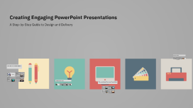
Transcript: Types of Presentations Presentations can be categorized into several types: informational, persuasive, instructional, and inspirational. Each serves a distinct function, necessitating tailored approaches to design and delivery. Importance of Visual Communication Visual communication plays a crucial role in presentations by facilitating comprehension and engagement. Studies show that visual elements can improve retention rates by up to 65% over text alone. Purpose of Presentations The primary purpose of presentations is to communicate information effectively to an audience. They can inform, persuade, or entertain, utilizing visual aids to enhance understanding and retention of key messages. Delivery Techniques Effective delivery techniques enhance presentation impact and audience retention. Engaging your audience, mastering body language, and efficiently managing Q&A sessions are crucial for ensuring a successful interaction and conveying your message effectively. Managing Q&A Sessions Engaging Your Audience Introduction to Presentations Q&A sessions are vital for audience interaction and feedback. Prepare by anticipating questions and providing concise, informative answers. Establish ground rules to ensure respect and order, encouraging diverse participation without dominating the discussion. Captivate your audience by making the content relevant and interactive. Utilize storytelling, relatable examples, and ask thought-provoking questions. Maintaining eye contact and using humor can facilitate connection and keep the audience interested in your message. Presentations serve as a powerful medium to communicate ideas, share insights, and engage audiences. Understanding their purposes and various types enhances effectiveness in delivering information. Body Language and Presence Non-verbal cues significantly impact audience perception. Use open gestures, maintain an upright posture, and vary your facial expressions to project confidence and authority. Effective presence can foster trust and increase audience receptivity to your message. Key Messaging Engaging Presentations Craft key messages that resonate with your audience. Limit each presentation to 2-3 core messages, ensuring they are specific, clear, and aligned with the audience's interests. Effective messaging increases retention and impacts decision-making, making your presentation memorable. Storytelling Techniques Incorporate storytelling into presentations to enhance engagement. Use relatable anecdotes or case studies to illustrate points, making the content more relatable. Emotional connections through storytelling can lead to greater audience involvement and make your message more persuasive. Transforming Ideas into Visual Masterpieces Structuring Content Typography A well-structured presentation helps convey messages clearly. Organize content into clear sections: introduction, body, and conclusion, using bullet points for easy understanding. This hierarchical approach ensures the audience follows your narrative seamlessly, emphasizing core points without overwhelming them with information. Typography affects readability and audience comprehension. Selecting appropriate fonts—considering size, weight, and style—ensures clarity. Use no more than two or three fonts to maintain consistency; also, ensure high contrast with background for better visibility. Designing Engaging Slides Crafting Your Message Effective messaging is crucial for impactful presentations. This section covers the essentials of content structure, key messaging strategies, and the art of storytelling to engage audiences dynamically. Color Schemes Effective slide design integrates layout, color, and typography to enhance the audience's understanding and engagement. A well-crafted slide communicates information clearly and captivates attention, making the presentation memorable. A cohesive color scheme enhances visual aesthetics and can evoke emotions. Utilize a limited palette to create harmony and contrast; for instance, complementary colors can draw attention while analogous colors create calm. Consider cultural implications of color choices. Layout and Composition The layout of a slide plays a crucial role in information delivery. A balanced composition utilizes the rule of thirds, ensuring elements are aligned for visual appeal. Consistent alignment and spacing improve readability and help maintain audience focus. Iterating for Future Presentations Iteration involves revising content based on feedback and performance analysis. Continuous improvements refine messaging, enhance visual elements, and improve delivery techniques to meet audience expectations effectively. Analyzing Performance Utilizing Visual Elements Performance analysis involves reviewing audience reactions and understanding engagement metrics. Tools such as analytics software or audience response systems can provide valuable insights into content effectiveness and speaker clarity. Images and Graphics Gathering

Engaging Presentations

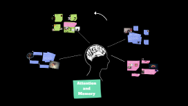
Transcript: Zoom out for more assets Asset library Analysis explanation Critical Question!!! B C What will life be without memories? and what can we do to improve our memory health wise? we have four main types of memory: The short-term memory, known as the working memory. It is active, temporary and fragile. It is the bridge between enconding and long-term memory. The long-term memory, known as the return to working memory. Memory are not retrieved in details. It is activily re-ordering of fragments. The declarative memory are those that can be experienced in our conscious awereness, such as a list of numbers. The non-declarative memory are thos that cannot be experinced in our conscious awereness, such as the motor skills necessary to ride a bike. We are not born to knowing everything we need to know about the world. medina 2014 pg. 128 A SO WHAT? So What? Memory provides a big survival advantge. We learn through experiences and teachings. Ou memory allows us to remember the encounters we've had with these experiences and the lessons learnt, for example, the ability to speak, ride a bike, play basket ball etc. This is an important concept to understand because in our modern culture we have a thousand distractions that can cause us to splitt our attention. If we are not careful we can start letting unimportant stimuli distract us from what is truly important and worthy of our attention. A Analysis Making a list of what we want to prioritise and getting rid of distractions is one way to help our brains focus. Using noise cancling headphones, going to libraries, and turning off notifications are all things people can utilize so that the brain does not have to try to multitask. B The Brain cannot Multitask While the brain can allow a person to walk and talk at the same time, it can not split its attention to two tasks at once, such as listing to a professor and doing other homework (Medina, 2008, p. 115). C Critical Question Would limiting unnecessary stimuli in our society today help people to feel like they do not have to juggle a hundred things at once? What are ways we could get rid of exstra stimuli? A So What? Without this ability we would have to force ourselves to memorize what is going on around us at all times, but automatic processing makes recalling details of a wedding, hike, or classroom much easier. Automatic Processing pg133 This form of memory takes place when we try to recall an experience. We automatically take in what happens around us during an event, making it easy for our brains to recall and process (Medina, 2008, p. 134). B A Analysis SO WHAT? We have a common impression that our brain is a lot like a recording device. to learn we push the 'record' button and to remeber we hit the 'play' button. WRONG!!! This ability is the opposite of effortful processing which reqires us to purposfully remember things such as a passcodes or phone numbers. We understand what is being taken in automatically and what needs more effort to be memorized then we can start to make descions based on these facts. For example, when going to an art museum you know you will remember the general beauty of the place, but decide to really study a certian painting you want to remember. We don't just press the "record". medina 2014 pg. 131 C Critical Question Is there a ways we can improve our automatic processing so that we can be even more accurate when recalling events? B Analysis Explanation Our brain is like a blender. As we learn, the information is chopped into pieces and splattered all over the insides of our mind. This happens immediately we look at a complex picture, for example, it extracts the diagonal lines from the vertical lines and stores them in seperate areas . same with color, if the picture is moving, the fact of its motion will be extracted and stored in a sepepate place than if the picture were static. This leads to encoding. To encode information means to convert data into code. our brain translate external source energy into electrical patterns the brain can understand. Encoding envolves all our senses and their processing center are scatttered throughout the brain. C Critical Question!!! What could we do better to develop our sense of encoding? Are there other ways to develop encoding in our brains? Attention and Memory

Engaging Presentations

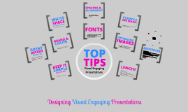
Transcript: (STEAL IT) Designing Visual Engaging Presentations GREAT ARE MAGIC ALIGNMENT SPACING & KEEP IT http://noteandpoint.com/ http://www.fastcodesign.com/1669189/pinterests-founding-designer-shares-his-dead-simple-design-philosophy http://designinstruct.com/category/freeresources/http://noteandpoint.com/ http://darmano.typepad.com/logic_emotion/2011/09/slideshare.html http://www.slideshare.net/ethos3/presentations http://www.awwwards.com/100-greatest-free-fonts-collection.html http://www.dafont.com/ (IT'S A GOOD THING) SYMBOLS DESIGN FONTS RESOURCES do not overcrowd slides with text and visuals 25-30 slides max keep one main idea per slide cover no more than 3 main ideas to support overall goal or message less slides mean more time for interaction BRAND & SIMPLE before (LESS IS MORE) keep in mind AFSCME's logo, brand and colors when representing the union's message and goals LENGTH WHITE DESIGN instead of using words use symbols i.e. for a yes or a positive use a thumbs up symbol Battles will continue in state capitols across the country. The challenges are increasing for cities and counties. We must focus on jobs, protecting Medicare, Medicaid, Social Security and other vitally important programs. And electing pro-worker candidates to state legislatures, Congress and the White House. Florida IMAGES SOCIAL SECURITY take apart you favorite ads, websites and magazines see something you like visually; remix it and make something new taking things that you have an affinity for and finding a way to make it fit in using images is a great way to evoke emotion and engage your audience in the topic visuals can bring your presentation to life themes and structure should be reinforced and consistent throughout presentation MEDICARE STUNNING TOP TIPS Use no more than 2-3 styles of the same family line things up, use of white space dont's use the boring fonts installed your system download beautiful fun ones after http://prezi.com/ The Lay of the Land 2012 JOBS FONTS SPACE MEDICAID Visual Engaging Presentations PRESENTATIONS Governor: Scott (R) State House: 81 R, 39 D State Senate: 28 R, 12 D no bullet points are you giving a document or a presentation? COLOR Session Jan 10 – March 9 (extended session on redistricting to follow) What to watch for: Prohibition of Payroll Deductions Decertification of public employees unions Gutting the state Unemployment Insurance Trust Fund Attacks on pensions Privatization State hospitals Prisons

Now you can make any subject more engaging and memorable