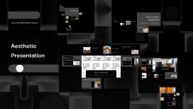
Aesthetic Presentation
Transcript: Aesthetic Presentation Crafting Visual Appeal in Communication Color Theory Color theory involves understanding how colors interact and influence perception. Utilizing a cohesive color palette can evoke emotions and enhance branding, with complementary and analogous colors creating visual interest while maintaining harmony in presentations. White Space Usage Balance and Alignment Typography White space, or negative space, is the area around design elements that provides breathing room for the audience. Effective use of white space enhances comprehension by reducing clutter, allowing content to stand out and facilitating a more enjoyable viewing experience. Balance in design creates a stable and harmonious feel, while alignment refers to the arrangement of elements in relation to each other. Achieving visual balance through symmetrical or asymmetrical layouts keeps the audience focused and enhances the overall aesthetics of the presentation. Typography encompasses the style, arrangement, and appearance of text in design. Effective typography enhances readability and guides the viewer’s attention; using a maximum of three typefaces and ensuring they align with the presentation's mood and message is key for optimal impact. Imagery and Iconography Imagery and iconography play crucial roles in visual storytelling. High-quality images and well-designed icons support the narrative and offer visual breaks, while ensuring that they align with the presentation's themes enhances engagement and retention. Visual Design Principles Understanding the key visual design principles enhances the effectiveness of presentations, ensuring they are not only aesthetically pleasing but also facilitate clear communication. Key aspects include balance, color theory, typography, imagery, and white space, each contributing to the overall impact of the design. Historical Overview Tips for Creating Engaging Visuals Design Resources and Templates The concept of aesthetics has evolved significantly over centuries, influenced by art movements, philosophy, and technology. Understanding its history can provide insights into contemporary design trends. To enhance engagement, use high-quality images that complement text, maintain a consistent color scheme, and keep slides uncluttered. Prioritize readability by using legible fonts and sizes, ensuring accessibility for all audience members. Resources like Envato Elements and Creative Market provide a plethora of templates tailored for aesthetic presentations. These templates streamline the design process and ensure consistency across presentations, contributing to overall professionalism. Key Elements of Aesthetic Design Software for Aesthetic Presentations Why Aesthetic Presentations Matter Case Studies of Successful Presentations Effective aesthetic design includes elements like color, typography, balance, and imagery. Each component plays a crucial role in creating harmony and enhancing visual communication in presentations. Aesthetic presentations enhance audience engagement and comprehension. They create a memorable experience that can lead to increased retention of information and a stronger emotional connection with the content. Key software options for creating aesthetic presentations include Microsoft PowerPoint, Google Slides, and Canva. These platforms offer various features such as templates, graphics, and collaborative options, making them ideal for visual storytelling. Analyzing successful presentations, such as TED Talks, reveals key techniques like storytelling, strategic pacing, and effective use of visuals. These examples showcase how a well-crafted aesthetic can elevate message delivery and audience retention. What is Aesthetics? Aesthetics pertains to the principles of beauty and artistic taste. It examines how visual elements influence perception, making it vital in presentation design to captivate audiences effectively. Tools and Techniques Introduction to Aesthetics Aesthetic presentations rely on the right tools and techniques to effectively convey messages. Utilizing advanced software and design resources enhances visual appeal and audience engagement. Understanding aesthetics is crucial in creating impactful presentations that resonate visually and emotionally with audiences. This section explores the definition, importance, historical context, and key elements of aesthetic design. Fine-tuning... Dive deep into your first point or make a new one Limit your words so your audience stays focused Use visuals to help Last checks... Expand on the bold statement above. Provide statistics, go into detail, or more — whatever works best for your presentation. Adding final touches... Thinking cap on... Polishing up... Keep your words short and punchy so your audience stays focused. Make it clear this is the end. Provide context for your audience and make it easy for them to follow. Hang on... A final point, a quote, more context — adapt the template to fit your needs. Remember that